Showing posts with label Research and Planning. Show all posts

Monday, 4 April 2016

Coursework Level: Personal Assessment

Level 3 Example
My Front Cover


I believe this piece of Level three work is most similar to mine. I have mostly based my decision on the similar primary visuals such as colour scheme and text layout. Despite this, I also believe my work is slightly more structured in relation to my working from the style model "Rolling Stone".

Thursday, 3 March 2016

Conventions: Text

I will use text on my magazine front cover however I will feature it on just one side similar to  how my style model, Rolling Stone, occasionally positions it's front cover text.


I will do this as I want my magazine cover to be minimalistic yet eye-catching without it being too busy.

Friday, 12 February 2016

Conventions: Slogan

The slogan I have chosen for my magazine, 'Lower the needle', I believe has a very clever relation to my title as to play a Vinyl record, you must lower the needle to listen to the music. I believe this slogan will convince my target audience to pick up my magazine because it is a play on words that presents the idea that by reading this magazine you will discover music just as you would by lowering the needle on a Vinyl record.

Conventions: Title

For my magazine, I struggled for weeks on what to name it as I was desperate for it to be completely original and unique that would be catchy, easy to remember and cleverly relate to what genre my magazine is, (mixed genre). At first I thought I had decided to call it 'Levels' however I quickly started to dislike it as I believed it wasn't unique and original enough, I therefore discarded it and continued to think hard about what would really fit well. I finally came up with the name 'Vinyl' whilst my Dad was playing so many different records at home on his record player, some old such as Anita Baker and some new such as Jake Bugg, and I loved it as soon as I imagined it on the front of the magazine.

This is because I was thinking about the fact that Vinyl records have been being produced for years and years and years, (The first Vinyl's were made in 1915 ) and they are still being made now despite the kind of technology we now have to play and buy music. There are endless genres of music being made on Vinyl Records from Classical to R&B, Rock and Roll to Pop which is a perfect representation of what my magazine includes, a variety of genres, quality music through the years (old and new) and their world class, talented artists.

Conventions: Central Image

My central image of my actor, Megan, will make the audience want to pick my magazine up and read as Megan is looking directly into the camera lens and portraying a serious, dominant and confident look which will indicate to the audience that she is a serious artist who's serious about her music. Despite her serious facial expression, she, overall, has a very youthful look which will draw in the kind of audience my magazine is aimed at.
Here is my Central Image:
Cover Photo Inspiration

Megan is wearing a bold red lipstick, soft pink eye shadow and dark black mascara and winged eyeliner. Her ashy, light blonde/white hair has a lot of volume and is not neatly styled but portrays her edgy, shabby chic look perfectly. The pale lilac top she is wearing and the bold, deep red lipstick presents a clear juxtaposition between the overall youthfulness and the more mature, intense side of the image and what message my actor is portraying to the audience (What kind of magazine 'Vinyl' is: Youthful yet mature, exclusive and edgy).

The cover my photo is inspired by is a Rolling Stone cover that features Debbie Harry (Blondie). It immediately struck me as a very fitting and appropriate, main, style model as I knew I wanted my magazine to have similar styling aspects to the Rolling Stone magazine. I knew my model would be Megan, and I knew she would fit in perfectly with my vision and exactly what kind of message I wanted my magazine to present and the kind of look I knew would attract my main target audience (Young Professionals:17-30).

Friday, 5 February 2016

Conventions: Price

The price I have chosen for my music magazine, Vinyl, will be between £4.00-£4.50 and I have chosen this specific price because it is a little lower than the similar kinds of magazine that have inspired mine. This would potentially persuade people to purchase my magazine over a more expensive, similar magazine. Due to the fact I have mainly aimed my magazine at young professionals, but will be suitable for older readers also, I believe this price is suitable and I didn't want to set the price too low as this may portray to the audience the idea that the magazine will be of low quality despite the fact it is in fact high quality. The price will be located in the top right hand corner of my magazine as, unlike my style model, I have decided to fill the space in the bottom left hand corner. The barcode and issue date will also be located in the top right hand corner.

Tuesday, 26 January 2016

Time Management-Double Page Spread Selection

Here are a 3 photos that I have taken during my photo shoot with my actor, Megan, that will be the selection that I choose my Double page spread photo from. They are of very high quality in my opinion and I believe I will struggle in choosing the best one. To help me I am considering holding a survey within my class to see what others believe is the best photo to be included within my music magazine.

I really like the poses i have chosen as I believe they portray a confident, powerful attitude that are also very endearing. My favourite photo, potentially, for my double page spread is where my actor is lying on her back looking straight to the camera. This is because I believe it will work and look the best across the double page spread and there is more than enough room for any text I will add. The lighting and shadows inflicted on my actor in all of my photos I believe is very strong however I may do some editing on photo shop to possibly further improve the photo.

I believe the poses are strong and appropriate for my target audience because they show a confident and moody attitude.

Time Management-Contents Page Best Selection

Here are a 3 photos that I have taken during my photo shoot with my actor, Megan, that will be the selection that I choose my contents page photo from. They are the best quality photos I have taken for my contents page. I admit one of my chosen photos presented in the middle is slightly blurry but I wanted to include it in my selection as I believe despite this, the pose, hair, makeup and costume is very strong.

My favourite photo out of  the selection I have chosen here is the third photo listed where my actor is leaning slightly to the right looking straight to the camera with her head slightly tilted to the side and back. I decided, for my contents page, to do a near full body shot with a large space at the side of my actor so that I can have any text, and the list of content, in a blank space so that it can be easily read by readers and they can also see the main feature, Megan.

Friday, 22 January 2016

Time Management-Front Cover Best Selection

Here are a 5 photos that I have taken during my photo shoot with my actor to potentially be my front cover for the music magazine as I believe they are the best selection.
I have chose these specific photos as they all portray the kind of attitude I want my magazine to display throughout, and they are all very strong, good quality photos with all different, diverse poses.
As my target audience is Young professionals, both male and female, but also is suitable for an older audience, I believe the photos I have chosen are very appropriate as they don't portray a very young look similar to, for example, We Love Pop magazine, but a professional, moody and enticing look.
Because I decided to reject any use of props, I believe this worked to my advantage as the shots are simple yet extremely effective and make a big impact on the viewer, especially the shots where Megan, my actor, is look straight at the camera.

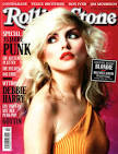
This photo of Blondie on the Rolling Stone Magazine was my inspiration for my front cover shot.

Wednesday, 20 January 2016

Time Management-Photo Shoot

My photo shoot was extremely successful regarding my desired quality of photos and I was able to stick to my scheduled plan of taking them at the weekend as my actor was very cooperative and professional. All costume that I had planned to use were taken from my own wardrobe and worked well in the variety of shots I'd taken. However, in a selection of my shots, I decided to change the top that my actor was wearing as I wanted to experiment with a different colour from the initial lilac/purple top I'd chosen, to a more vibrant orange colour to see how the lighting I was using would compliment my camera angles and my actors look.
I took my photos against my bedroom wall, which was a perfect back drop for my photos as it is completely plain and would emphasise the colours my actor was wearing and the shadows inflicted upon my actor from my chosen light source.

For the lighting for my photoshoot, I turned all the lights off, and used solely the light from a small lamp I had in my room, and held it with the hand I was not holding the camera with, to inflict the different light spots and shadow areas I desired for each shot I was taking. I held the lamp and moved it depending on what kind of shadows I wanted to appear on my actor and I would use different light placement for the same shot, at times, to see which one worked most effectively and looked best.
I took around 40 shots as I wanted to have a large selection that I could choose the very best quality ones to be featured in my magazine. By doing this I can also analyse the shots I believe weren't the best quality, e.g. blurred images, so I can show my improvement throughout the photo shoot process.


Saturday, 9 January 2016

Time Managment-Photoshoot Weekend

This weekend I have fully completed my photo shoot and I believe it went extremely well and I have a large selection of photos that have a lot of potential to feature in my magazine. Me and my actor, Megan, worked very well together and Megan was very cooperative throughout the photo shoot process. This gave me confidence when taking my photos because I knew that we worked well together from the very first shot to the last. The look I chose for my actor, based on the front cover of a Rolling Stone magazine(featuring Blondie on the cover), looked amazing in my photos and really embodied the attitude and confident aura I desire my music magazine will portray.

I have taken a variety of shots for my front cover, contents page and double page spread in order for me to have a good selection to choose from and I can assure myself that I will pick the highest quality and most effective shots to feature in my music Magazine, Vinyl.
The photos I believe are the best in each selection, Front cover, Contents Page and Double Page Spread, will be featured in a future blog.

Thursday, 7 January 2016

Permissions Required

The only permissions required for my photoshoot is permission to borrow the camera from my teacher. All other aspects for the photoshoot I already have access to as I'm taking the photos in my home and all makeup, lighting and costume has come from me. I will be using a Canon camera to take my photos fro my Magazine.

Time Managent-Photoshoot:Preparation

Today I have received a camera from my Media Teacher so I am ready to start my photo shoot process tomorrow on Saturday and on Sunday if needs be. My location, costume and makeup has been decided for while and I am confident that where and what I have chosen regarding Mise en Scene will work effectively. Due to the face that I have prepared early, I'm sure my photo shoot will run smoothly with minimal or no problems occurring during. I know that my actor, Megan, is free all weekend enabling me to take all the time I need to take the best quality photos I can.

Tuesday, 5 January 2016

Time Management

This week I have been planning my photography process for my magazine photos and exactly when and where I will be doing them. This week I have also made a definite decision on what my magazine will be called and I have decided on the name, 'Vinyl'.
I will be receiving a camera today so that I can take my photos this weekend. My photos will be taken against a blank background as I have now decided that, depending on the lighting I use, I may use the original background, but if I believe it doesn't look the quality I would like it to be, I will edit the background using photoshop or DTP software.
  

My Front Cover Inspiration

A large amount of my inspiration for my Front Cover shot comes from a Rolling Stone front cover featuring Blondie. This is because she embodies exactly what I want my magazine to portray which is a legitimate aura of confidence and attitude but an attitude that can be admired rather than looked negatively upon or presents a negative feeling. I will work hard when taking the photos for my magazine so that they are the highest quality that I can achieve and so that they look as professional as possible.


Tuesday, 15 December 2015

Mise en Scene: Time Management

I have addressed and accepted the fact that I will not in fact be able to fully complete, to the best standard, all that I have planned to do surrounding the Mise en Scene aspects of my front cover and double page spread this term, however I will reschedule the things I will not be able to complete in the January month. I believe by doing this, I am not forced to rush myself to finish abruptly, which would potentially cause me to jeopardise the standard and quality of my work.

Friday, 11 December 2015

Mise en Scene: Props

I have decided not to use props as I believe it will not further improve or add anything to my front cover or double page spread. My style model 'Rolling stone' doesn't use very many props and I believe it is because the cover focuses on the main feature which is what I want to replicate.


All of the examples I have posted above don't have any props featured on the cover which is what I aim  to also do. I believe that it makes the cover more simplistic but effective because you are forced to focus on the main feature, which is usually the singer/artist/actor/band.

Mise en Scene: Location

I've decided to take my photo's against a white background, such as the white curtains in my house, because I have not completely decided whether or not I will edit the background out, however if not, I would like to have a white background. I would either like a black or white background because my actor and what my actor is wearing will stand out and be eye catching.
This is done by my style model, 'Rolling Stone' as shown below:

Thursday, 10 December 2015

Mise en Scene: Actors

                                         My actor-Megan
For my magazine, I will have one main actor, Megan, because she is the main feature of my magazine and I believe it will be more eye catching. This is similarly done by my style model, Rolling Stone, with most of it's covers.


Mise en Scene: Camera Angles

The type of camera angles I am considering for my front cover are low angle with my actor looking down to the camera or looking away from the camera, and a medium close up shot with my actor looking straight at the camera. I have decided to choose between these shots because they portray a cool attitude. This ties in well with what I want my magazine to be like and I believe it will attract people to buy my magazine.
My inspiration for these shots are from my style model 'Rolling Stone' because I believe they have an edgy vibe with there striking camera angles and fashion, that I wish to resemble in my own magazine.
Camera-Low Angle
Actor-Looking away
Camera-Medium Close Up
Actor-Looking straight to the camera